
Okay to recap we are going for a classical approach to fashion. This means that we want all the elements — shapes, color — to be in harmony.
The previous post is available here
So what does harmony look like for color?
This idea comes from Mariam Style, a fashion channel on YouTube. I’ve never encountered this idea before on the internet and it impacted the way I look at human beings.
It comes from this video.
According to Mariam, all human skin tones can be classified by two perimeters.
Saturation: high or low?
Saturation is how bright a color is.
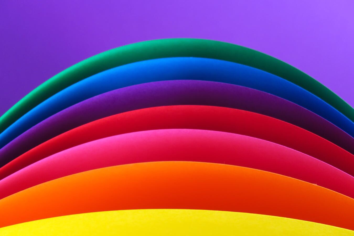
High saturation examples
These are called “bright” colors.


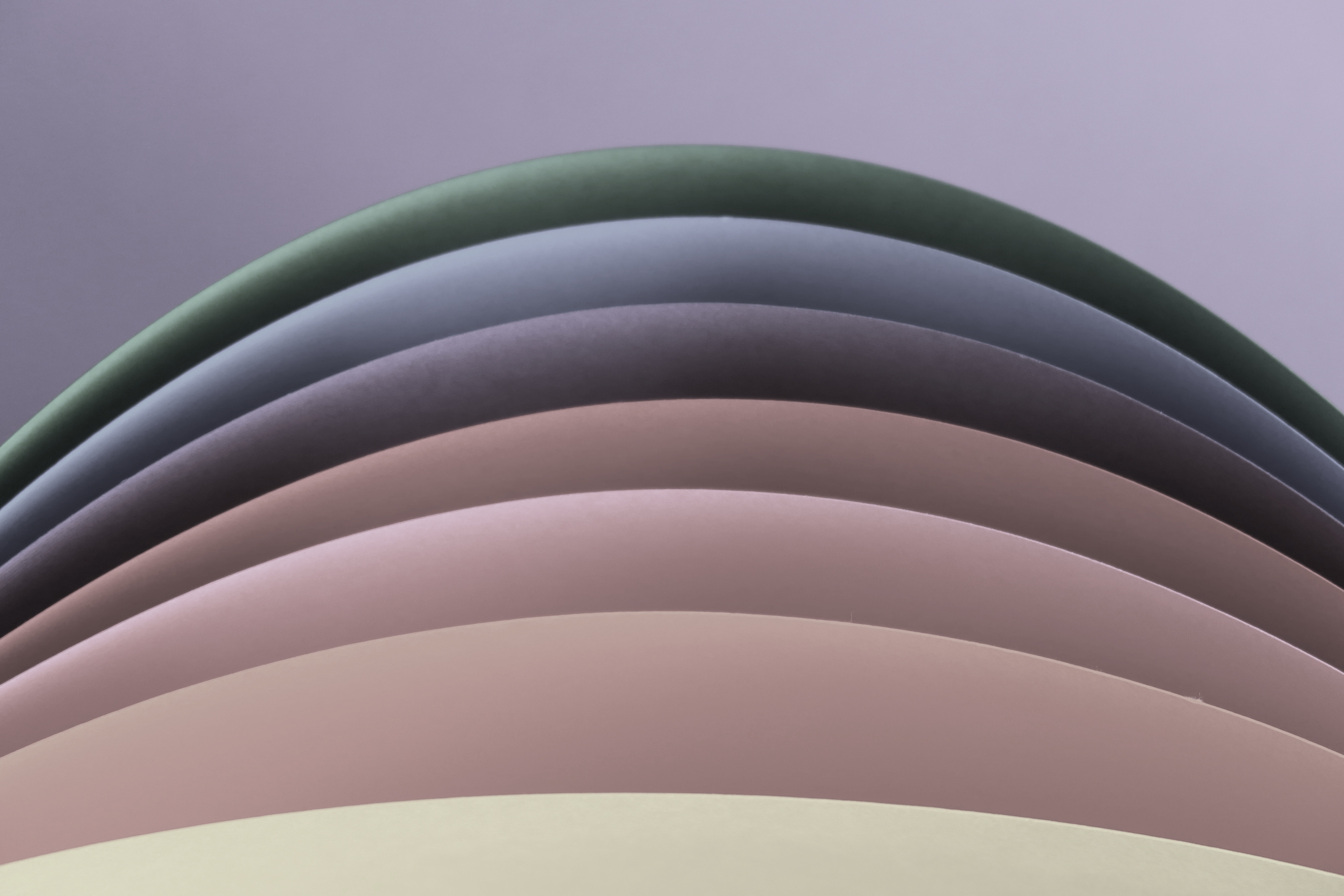
Low saturation examples
These are called “muted” colors.


Compare these photos. They’re both the same photo, but manipulated to be bright or muted. Look at the difference.

Tone: more blue or more yellow?
Human skin colors are made like this:
(Red + Yellow + Blue) + (White + Black)
The (Red + Yellow + Blue) portion determines the tone. We will come back to this in a minute.
The (White + Black) portion determines saturation, or how bright or muted the skin tone is. This refers to the photos you were looking at a few seconds ago.
White and black make grey. The more grey you add to a color, the more muted it will become.
Now that you understand saturation, let’s move on to tone.
Tone: yellowish or blueish?
This is my reasoning. For some reason, human beings are sensitive to the yellow:blue ratio in a skin tone. This is probably because extreme yellows or extreme blues indicate serious ilness.
And while red is important too, there’s likely a smaller variation in how much red someone has in their skin.
Why? Again, this is my reasoning, but red = blood. And the amount of blood does not differ that much between each individual. Have you ever met somebody with 500 times more blood than you?
And for this reason, the fashion/makeup industry has their informational infrastructure set up around the blueblue:yellow ratio.
In English: When you’re shopping for clothes or makeup, you want to focus on how blue or how yellow a color is.
Yellow-ish colors
These are called “warm” tones.


Blue-ish colors
These are “cool” tones.


Combine tone with saturation.
Now we understand warm colors VS cool colors.
Let’s add on the knowledge of saturation on top of this. We can make a matrix like this.

And if you can determine which type your skin tone falls under, you can automatically know your best colors.
You may think ‘hmm this feels oddly like the four seasons system’ 🤔
If you’ve done any reading into fashion/makeup, you may be aware of something called the four seasons system, which classifies color palettes into something like this:

According to this system,
Winter= cool and bright
Summer= cool and muted
Spring= warm and bright
Autumn= warm and muted
And so it all seems fine…until it isn’t.
Because you see, on the internet, the colors recommended for autumn types often are not muted. Instead, what commonly happens is that they are recommending non-muted dark colors.

This is because it is simply hard to spot saturation in darker colors. The color on the top right definitely feels “autumn”ish, and feels muted, but it really isn’t. It is actually pretty bright. Depending on the wearer, the color could completely overpower their complexion.
What happens when someone with low saturation wears an overly bright color?
They will look tired and washed out. This is definitely not a look we want to achieve.
So you see, saturation is very important when selecting colors.
Hello everyone. I’m exhausted from making the images and don’t know if I can keep this up for much longer.
I think I’ll take a break from this series and go back to more text-heavy content. To recharge😂
I have a twitter now! @bluntjapanese
I post photos of the cool things I find on my shopping trips over here in Tokyo😎

One thought on “How to choose clothes that actually look good on you (for intellectuals) Part 2: Color theory”
Comments are closed.